|
|
2002 Proposal for Site Design --- Washington Square Arts / Films
I reviewed print materials from a corporate identity overhaul, and proposed that the company adapt similar graphic elements to their site, also adding a number of animated graphic elements, and keeping a similar color scheme.
1. Add an animated flash intro page, something that would build up graphically to the main rollover that leads into the 2 general business areas. (see sample above)
|
| 2. Adapt the "socket & plug" theme that was used in their Arts Roster Promo into a random visual effect on a hot link.
3. Build in more randomness, as pages load, such as the substitution of letters in the titles, similar their business cards.
|

|
|
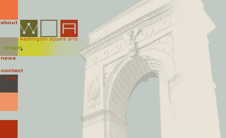
| 4. Adapt a version of their promo brochure cover to use as a general Web homepage layout with navigation layout plan. (see sample mock-up below) Colors of the side squares were to change or animate with user rollovers, and to indicate the different categories in the site. |
|
|
|
These clients did not go forward with this design plan.
|
